People are hating on Apple Music's redesigned black-and-white logo
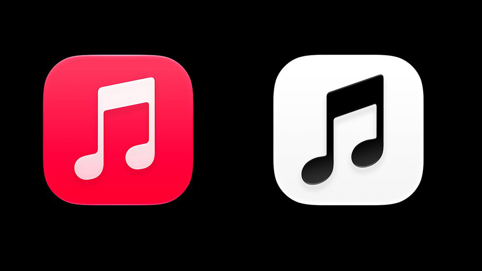
'Boring,' 'Generic,' 'Graphics design is my passion vibes' are a few of the kinder comments.
Engadget
Apple Music appears to be changing its 13-year-old, iconic red "beamed eighth note" icon to a much simpler black and white version, to the consternation of a large part of the internet. The new logo has appeared in iOS 27.2 beta 4 with the new logo and an opposite scheme (white on black) in dark mode. That follows an apparent change to the full Apple Music logo to a bolder, all-lowercase logo first seen with the launch of Apple Music Hall, the company's new venue in London.
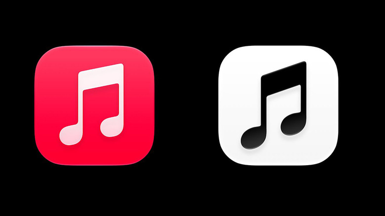
Along with wiping out the color, the new logo is tilted slightly more to the left, the bottom of the notes are more oval-shaped and there's a very subtle drop shadow under the bar and notes. Apple also has a "Clear" version, and as with other icons, you can tint it to any color. Along with the icon change, Apple also removed the red color from the home screen widgets and changed the pink/red tint inside the app to blue.
Apple has a rich history of riling up users by changing its icons and entire UI, though people usually get used to the changes and then scoff at the previous design. Still, the Music icon change appears to have struck a wrong chord (sorry) with users, who mainly found it dull and unnecessary, as Cult of Mac reported.
"This is the worst logo change of all time," said one commenter. "Graphics is my passion-a** logo" said our news editor. Others were in the same vein. "Apple Music, but emo," "they sucked up the charm," etc. Some people liked it, though: "That's a great icon. That red made no sense to me," said one. "I love it," said the X poster who was among the first to show off the update.
Personally, design and icon changes always leave me confused for awhile, as if someone put all my dishes into a different cupboard. Logo and design buffs will no doubt have their say, but so far, this update seems to have more critics than fans. The app is still in beta so Apple could still change its mind, but the company usually sticks to its guns on such changes.
KioskNews shows a cleaned-up reading view extracted from the publisher’s page — the original always lives on their site, not ours.