From the best to the worst: Our definitive ranking of the NHL Hometown Remix jerseys

Greg WyshynskiNov 2, 2026, 10:00 AM ET
- Greg Wyshynski is ESPN's senior NHL writer.
The NHL Hometown Remix jerseys are here, and some of them are spectacular.
And some of them aren't.
When Fanatics became the NHL's official on-ice uniform outfitter in the 2024-25 season, it was expected to take a couple of seasons before attempting its first "all 32 teams" alternate jersey project, like the Reverse Retro jerseys Adidas created for the NHL in 2020 and 2022.
"It was always envisioned with 'How do we do something different than what Adidas did with Reverse Retro 1.0 and 2.0?'" said Brian Jennings, NHL chief branding officer and senior executive vice president.
Enter NHL Hometown Remix jerseys, which officially launched Monday morning after weeks of tantalizing leaks.
The concept was simple: Have teams create distinct new looks that would theoretically tie back to the places they play and the fans for whom they play.
"When Hometown Remix came in and we started those conversations, I was like, 'OK, there's something here in this hyperlocal thing.' The part that got me really excited was the buy-in from the clubs," Jennings said.
Some teams seemed to really understand the assignment, and others sort of faked their way through it.
Here is our ranking of the 32 NHL Hometown Remix jerseys for the 2026-27 season, which (for now) is expected to be the only season in which they're worn.
We've reviewed the jerseys in person at Fanatics and have seen what they look like with a full uniform and on the ice. Our ranking is based on how good they look, how innovative they are and how well they tie in with the mission of the Hometown Remix jerseys.
Let's start with what we consider to be the best.

No. 1: Pittsburgh Penguins
Andy Warhol, then Andrew Warhola Jr., was born in Pittsburgh in 1928, nearly 40 years before the Penguins entered the NHL. His ties to the city -- home to The Andy Warhol Museum -- are part of a larger connection between the pop art movement and Pittsburgh, carried on by locals such as Burton Morris.
If the primary ethos of the Hometown Remix project is to connect the jersey to the city, then Pittsburgh gets enormous credit for doing it without relying on, say, architecture or weather phenomena. It doesn't mine franchise history for an obscure look from which to draw; it's reimagining the team's primary logo for the better part of 55 years, although it nods to previous team color schemes, too.
But that's only half the mission for the Hometown Remix jersey project. The other is "does this look good?"
We'd argue it looks the best.
Lost in the Microsoft Paint leak mockups was the offset outline around the Penguin, giving it a sense of motion while also being slightly disorienting. The dotted yellow background of the logo is like if Roy Lichtenstein were commissioned to create a Stadium Series jersey. It's the epitome of pop art: Something familiar, from the Igloo tribute on the shoulder to the numbers on the back, reinterpreted in a way that uses that nostalgia to push in a bold new direction.
There are probably very good, potentially litigious reasons they couldn't go full Warhol here -- imagine a jersey with the same four logos on the front done in the style of Warhol's Campbell's soup can? However, we did love the nod to his art on the hem as the word "Pittsburgh" is repeated several times in several colors to represent the city's different boroughs.
Both jersey rankings and art are inherently subjective. From our perspective, nothing in this batch of new sweaters married concept and execution better than the Penguins did. These are the best.
No. 2: Anaheim Ducks
Finally answering the question: What if Anaheim had entered the NHL leaning all the way in to its namesake and dressed like Gordon Bombay's Mighty Ducks?
Fanatics has a bunch of stuff in its media materials about the fresh green parks and golden sunsets of Orange County. But this is Charlie Conway. This is Marguerite Moreau. This is the Flying V and "fly together." This is "The Mighty Ducks," through and through. It's a jersey that would have 100% turned up in a SoCal hip-hop video voted No. 1 on "TRL" in 1998.
It also made us wonder whether New Orleans should get an NHL expansion team, because this jersey also looks a few shades (and bead necklaces) away from being Mardi Gras-ready.
No. 3: Florida Panthers
The Panthers had the best Reverse Retro 2.0 jersey back in 2022 when they finally made their stick-and-palm secondary logo their primary crest, ending a 30-year run of sweaters that did everything but evoke South Florida.
Well, there's no mistaking South Florida this time, folks! The Panthers run back that awesome logo augmented by a sunrise -- the team plays in Sunrise, for locality's sake -- whose colors are used throughout the jersey. That includes the most distinct and bold primary color ever seen on an NHL jersey.
They call it "coral." Everyone else will call it pink. Whatever you call it, the Panthers took a swing few have taken in a pro sports jersey -- although it should be noted that the MLS' Inter Miami walked so Florida could skate in "coral."
An undeniable facet of this jersey's success is that the right group of players is wearing them. Few teams are as in-your-face as the Panthers, literally and figuratively. The juxtaposition between some of the NHL's most unrelentingly nasty and physical players and a jersey that looks like a beach cocktail is intoxicating. Radko Gudas is going to throw one of these jerseys, folks. Let that soak in.
No. 4: Nashville Predators
Outside of some guitar strings on the numbers and piano keys in the collar, the Predators have never really leaned in to the honky-tonk of it all in Nashville. Creating a jersey that looks like country music stage wear -- from the flourishes on the shoulders to the filigree in the crest -- is such an obvious winner in retrospect. It's sort of amazing it took this long.
While many of us will be enthralled by a team that looks ready to play a cover of "I Walk the Line" at Tootsies, Predators fans are no doubt happy to see the team return to a sharp navy base for the first time in around 15 years. It's a valentine to the Broadway music bars near the arena, a nod to some great Predators uniforms of the past and just a stellar hockey jersey.
No. 5: Montreal Canadiens
It's hard to pull off an innovative and compelling white jersey, as evidenced by the Hometown Remix program having produced only four of them. The Canadiens' sweater is easily the best of that bunch and a contender for best overall, given how it looks and the story it tells.
On the sleeves: white pine, fleur-de-lys, rose, thistle and clover. The five symbols on the flag of Montreal, whose red and white colorway inform the rest of this design. The side panels are meant to evoke the eponymous Mount Royal. The number system is inspired by Old Montreal. The crest has texturing designed to honor the stonework around the city.
Montreal's specialty jerseys have typically dipped back into the franchise's history for inspiration -- remember the "barber pole" sweaters from its centennial celebration? Well, these keep the general template of a Canadiens jersey. There's a real audacity to the design, given the jerseys that have come before them. These sweaters are going to look magnifique on the ice and are a deeply detailed love letter to the city that loves its Habs endlessly.
No. 6: Washington Capitals
Amanda Tischler, the Capitals' senior vice president of marketing, told ESPN it was a happy accident that their Hometown Remix jersey runs back the Capitol dome logo the team wore when Alex Ovechkin entered the NHL, just as the Great 8 is in his final season in the league.
There are few other Hometown Remix jerseys that seem like they should have been a team's primary jersey sometime in the past. We're so accustomed to "Rock the Red" that we forget their jerseys didn't even have that color for about a dozen years in the 1990s and early aughts.
Along with the dome, the other local connection is the marble texturing of the sleeves and shoulder yoke. We think it's pretty innovative, but it's also understandable that some might see it as one gimmick too many. One person's "Wow, it looks like a D.C. monument!" is another person's "Why do the shoulders look dirty?"
No. 7: Detroit Red Wings
As you'll see later in this ranking, challenging an Original Six team to remix a nearly century-old look isn't easy. That especially goes for the Red Wings, whose Winged Wheel is one of the most iconic looks in sports. They're not going to suddenly bust out a purple jersey with an octopus maw on the front. They're just not.
The cephalopod is referenced on the hem of the jersey, but the rest of the sweater is dedicated to two dogmas: that the Red Wings' jerseys can't be improved on and that even in these dark times for the franchise, Detroit is still "Hockeytown." They've had words atop their logo before (such as on their 2014 Winter Classic sweaters) but had never had "Hockeytown" so front and center. These rock.
No. 8: Toronto Maple Leafs
There are a few jerseys in this ranking that could have finished much higher were it not for one or two missteps in design.
The good for Toronto: The remixing of its primary logo, with its eye-catching silhouette and intricate texturing that's carried over to the sleeves and the numbers. We also love that the various "Leafs" that have appeared on their jerseys are represented on the hem. The wordmark is large, making the whole front of the jersey a bit grandiose in keeping with the Centre of the Hockey Universe™.
The not as good for Toronto: Those white stripes harsh the vibe, don't they? Obviously, white sleeve striping on Leafs sweaters tracks back to 1927. But here, they just don't seem like a piece with the rest of the fit. They throw the whole thing off balance, like a confused spouse throwing multicolored carnations into a bouquet of a dozen roses.
No. 9: Carolina Hurricanes
Hot take: The Hurricanes need a new logo. This is a hard argument to make when they just lifted the Stanley Cup while wearing their swirly toilet flush logo, but the sentiment remains.
Whether this collegiate rendering of their mascot, Stormy, could ever become their primary mark is debatable, but it's a step up. The problem here is that the logo is featured on a drab gray sweater that's inferior to the team's red and black looks.
One thing we do like here: All the nods to the "City of Oaks," including oak leaves debossed on the sleeves.
No. 10: Vegas Golden Knights
Gambling references? On the uniform of a team based in Las Vegas? Is that even allowed?!
The Golden Knights finally lean in to casino iconography with felt table green on the shoulders, a roulette wheel pattern on the sleeves and socks, a typeface inspired by playing cards, and different card suits found around the jersey. Plus, there's an embossed script "Vegas" on the arms. It's a distinct look for the Knights that finally connects with everything around them on The Strip -- although it would have been fun to see the primary logo rendered in a winning slot machine combo. Maybe next time.
No. 11: Minnesota Wild
We went back and forth on this one. Black jerseys are beyond cliché. The Wild have traded in one of the NHL's most distinct color schemes for something that screams "recently relocated AHL franchise."
But this jersey improves mightily upon further inspection. Their primary logo has never looked better. The sleeves have a debossed Ursa Major and Ursa Minor, and the numbers have stars to evoke the Twin Cities. As an ode to cold Minnesota nights on the pond -- and the mysteries of space -- we're here for it.
No. 12: Dallas Stars
This is essentially a neon electrified version of the Stars' current road jerseys, with much bolder striping. The texture on the crest is supposed to be inspired by the city's skyline at night. Dallas could have gone a hundred ways with these jerseys, but the path it chose produced a stark on-ice look, if not exactly an innovative or city-specific one. But a must-own for fans of Monster Energy drink, one assumes.
No. 13: Columbus Blue Jackets
These would have gone so much harder had the Blue Jackets not worn their cannon as the primary crest of their 2025 NHL Stadium Series jerseys. These are still solid, and it's the first time the Blue Jackets have used gray as the base color for one of their jerseys. Maybe the best thing about these are the large stripes on the sleeves. The arching on them is in reference to Columbus being the "Arch City." They also threw a little "5th Line" graphic on the hem for the fans.
No. 14: Los Angeles Kings
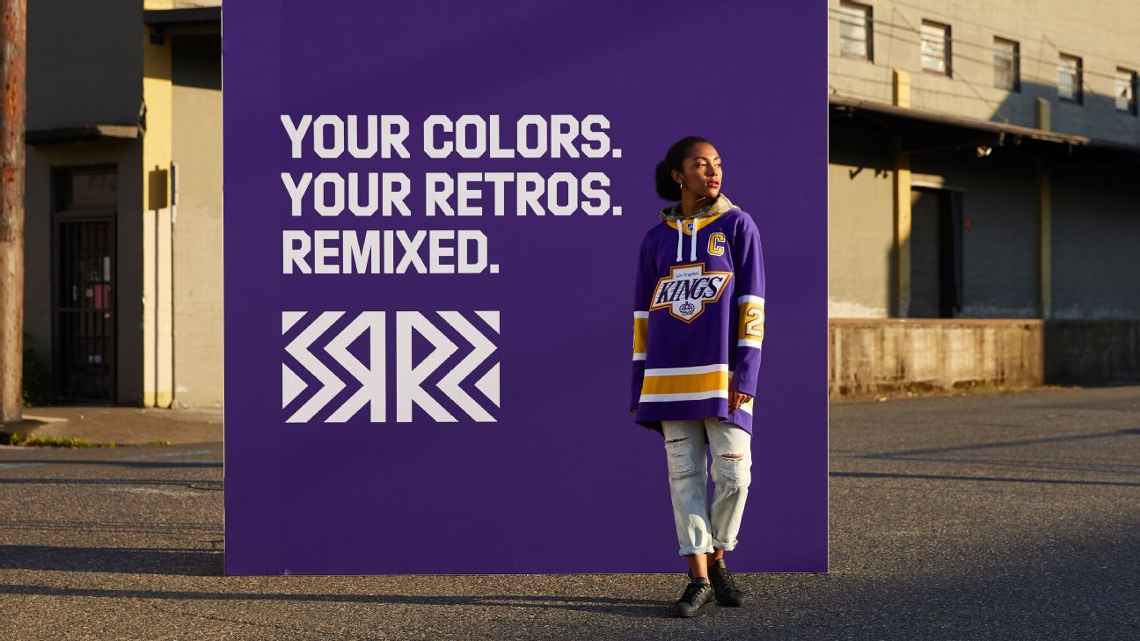
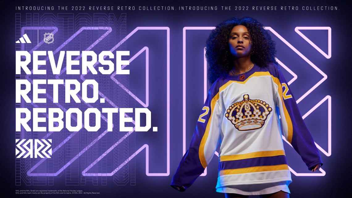
The Kings are fighting history in their Hometown Remix look, which takes all their previous looks and puts them in a blender set to "streetwear."
The Kings did similar things to better success in their Reverse Retro 1.0 and 2.0 sweaters. These are still really solid and have some nice innovations -- the "Hollywood-inspired serif font" used for Los Angeles in the logo is sublime. But the palm leaves embossed on the sleeves are giving barbed-wire bicep tattoo from the 1990s.
No. 15: Tampa Bay Lightning
When the Tampa Bay Lightning released their Stadium Series jerseys last season, the hockey world had one question: "Hey, why wasn't that awesome Gasparilla-adjacent pirate skull logo on the shoulder the primary logo instead?" Maybe because it was already on deck for the Hometown Remix.
The David Bowie-esque lightning bolt on the skull -- and the missing tooth they gave it in this incarnation -- makes this one of the better alternate logos in hockey. But again, what could have been: Imagine how sweet these jerseys would be with a blue base and a black logo, rather than becoming the sixth variation of a black-based jersey in team history. (Don't they know black absorbs more heat and they play in Florida?)
No. 16: Seattle Kraken
Speaking of secondary logos that maybe deserve more prominence, the Kraken take their "Space Needle-as-anchor" logo from the shoulder to the front of the sweater, and it looks iconic. There are a lot of other local details on these, from a nod to Mt. Rainier on the sleeves to rhododendrons on the hem.
As Fanatics notes: "The new name and number system features custom nautical-inspired typography with meticulous scrimshaw embroidery, while the shoulder patch also brings scrimshaw detailing to the fore." One can never have enough scrimshaw.
No. 17: New York Islanders
The circle is complete. The fisherman jersey was one of the most widely mocked in NHL history, from the Islanders being called the "fish sticks" to those who felt its color scheme was reminiscent of toothpaste stripes. After being resurrected for Reverse Retro 2.0, the fisherman is back with something closer to the original color way from the 1990s. The logo has never looked better, and the entire jersey system looks great on the ice. Consider yourself redeemed, Mr. Fishsticks.
No. 18: Ottawa Senators
This feels like a Pokémon evolution of their current jersey, like Ottawa got to a certain experience level and everything became "metallic gold lurex." The bilingual shoulder patches are a nice touch. The geometric striping on the sleeves is giving both Ottawa gothic architecture and Doctor Doom spellcasting runes.
No. 19: San Jose Sharks
The teeth. It's all about the teeth. The look is clean. The logo has a youthful vibe to it that fits the surging rebuild in San Jose, led by star Macklin Celebrini. But we can't get past the teeth on the sleeves, which is giving a video game-like "create-a-jersey" rather than an ascendant Stanley Cup contender.
OK, if we're being honest: It's not the teeth, it's the gums. So many gums. There's a reason one of the greatest summer blockbusters of all-time wasn't called "Gums." Less gums, more jaws, please.
No. 20: Edmonton Oilers
Having a jersey that looks like it was dipped into a barrel of crude oil is either the greatest evocation of the Edmontonian aesthetic or a flimsy excuse to join the black jersey parade. Frankly, we were going to rank these a bit lower but then someone mentioned they're reminiscent of the all-time classic World Cup of Hockey Team North America jerseys from 2016, which Connor McDavid also wore.
No. 21: Buffalo Sabres
We can already hear people grabbing their pitchforks over this mashup of iconic Buffalo Sabres looks being ranked so lowly. But just like how a DJ can cut together two classic songs to make a mediocre one, the Sabres gorgeous blue sweaters mixed with "goat head" crests aren't in harmony.
This is the same issue we had back in 2022 when the Sabres put the "goat head" on a white and blue jersey for Reverse Retro 2.0. We actually ranked them 23rd overall in that tabulation, writing: "The 'goat head' logo loses its magic when stripped away from the red, black and silver color scheme that evoked images of Dominik Hasek saves and Miroslav Satan goals." The sentiment still stands.
No. 22: Calgary Flames
This one gets an "A" for concept alone: an entire jersey commemorating Calgary's final season in the Saddledome. That includes debossing on the sleeves to represent the arena's windows and the roofline being represented on the hem of the sweater. Unfortunately, using the texture of the arena ceiling on the "Flaming C" logo leaves it looking like an ode to breakfast waffles.
No. 23: New Jersey Devils
Is Lou Lamoriello still running this team? After breaking the template with the "Jersey" jerseys, which are now retired, the Devils retreated to what's essentially a black base version of their 2024 Stadium Series jersey. Not a bad looking jersey at all but it still feels like a missed opportunity given the team's name -- not to mention there's little "Hometown" in this remix.
No. 24: Winnipeg Jets
The Jets went in an interesting direction with their Hometown Remix sweaters: skyward. These jerseys are inspired by the Aurora Borealis, which can be seen in Winnipeg during the fall and winter. The jet on the crest is supposed to look like it has been lit by the Northern Lights, and the names and numbers are supposed to seem like they're glowing.
Neat idea, even if they're giving "what if we did tie-dye our Connor Hellebuyck jersey we're never wearing again?" energy.
No. 25: Philadelphia Flyers
We want to be kind to these jerseys, because the amount of detail in them is remarkable. The Flyers went with the Liberty Bell as inspiration, drawing everything from the spacing of the jersey's stripes to using the actual inscription on the bell on the sleeves to having a "crack" in their numbers system. But the Flyers are, and ever shall be, the orange and black. Making gray the primary color of a Flyers jersey -- while novel! -- just doesn't fit the motif.
No. 26: Utah Mammoth
The primary logo is Utah's secondary logo: a "U" with a tusk swooping through it. These are fine. What did you think you were getting? Snow kachina?
No. 27: Colorado Avalanche
The Avalanche topped our Reverse Retro 1.0 ranking with their Quebec Nordiques throwback. Their follow-up was less iconic, but a nice-looking sweater that incorporated the state flag. Their Hometown Remix sweater also uses that logo in a "frosted, glistening" ode to the Rocky Mountains. Perfect if you're cos-playing Elsa from "Frozen" as Cale Makar, less so as a specialty jersey.

No. 28: Boston Bruins
The Bruins have had a lot of different jerseys in the last 100 years, including nine different outdoor game looks. At some point, the wells of inspiration run a little dry. So for the Hometown Remix campaign, the team went with, "Hey, Boston sure does have a lot of colleges, huh?" Get one at your local campus bookstore.
No. 29: St. Louis Blues
The Blues have done this logo and look before as a third jersey and they were awesome in a way this one is not. But the real flaws in this Blues Remix sweater are all the forced references to the Mississippi River, from the ripples on the arms to the little wavey lines around the crest. Fanatics said: "Inspired by the dark waters of the Mississippi, black makes a striking appearance as the primary jersey color." OK then.
No. 30: Vancouver Canucks
This is, like, the third or fourth jersey to celebrate "the city after dark" and by far the most ordinary, even with the city skyline on the sleeves. The crest features "a stealth-mode orca in deep blues with shining silver eyes," which sure sounds better than it looks.
No. 31: New York Rangers
The Rangers' specialty jerseys either have some diagonal wordmark or one of two logos they've used since the 1990s. For their Hometown Remix jersey, they have some diagonal wordmark AND one of two logos they've used since the 1990s, in this case the famed Liberty Head.
No. 32: Chicago Blackhawks
Finally, here's an unfortunate manufacturing error in which a Chicago Blackhawks' logo was mistakenly stitched onto a Dallas Stars jersey!
Wait, hold on, we're now being told this is the Blackhawks' Hometown Remix jersey.
For the first time, the team will wear a green jersey during games, as their green St. Patrick's Day jerseys were only worn in warmups back in the day. The Chicago flag is represented with four debossed stars on the sleeves to connect it to the city.
Why are the Blackhawks ranked last? Because they play in Chicago, a city with an endless amount of aesthetics and iconography that could make for an instant classic jersey.
This program is supposed to give teams the chance to highlight their locations or bond themselves to something locally iconic. Even if you wanted to make the case that these jerseys celebrate making the river green for St. Patrick's Day, it's still more about a random holiday than the city and its people. Wrestler CM Punk has a deeper connection to Chicago with his wrestling trunks. Use the flag. Use The Bean. Put a picture of Cousin from "The Bear" serving an Italian Beef Sandwich. Have a cow kicking over a lantern on the hem. Anything!
It's a missed opportunity and hopefully a lesson learned for whatever the next jersey program ends up being in the NHL.
KioskNews shows a cleaned-up reading view extracted from the publisher’s page — the original always lives on their site, not ours.