‘Pattern sandwiching’ trend brings balance to interiors
We independently select everything we recommend. Buying through us may earn us a commission, which supports our work.
A concept in fashion called “the sandwich method” is winning over interior design experts.
Sign In or Create an Account
The approach dictates that you wear the same colour at the top and bottom of an outfit — say, in a shirt and shoes — while choosing another colour or pattern for the skirt or pants between them. This creates a sense of balance, cohesion and symmetry that’s pleasing to the eye while allowing for variation and interest.
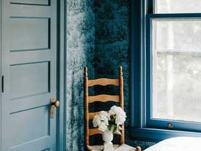
In the home, the sandwich method considers the trim, wainscotting, and ceiling as the proverbial bread of a room that surrounds the main walls.
“Pattern sandwiching moves the eye through the room in a way that feels energizing and sets the tone for everything else,” Heather French, of French & French Interiors, told Vogue. She added that the method is in line with the current push toward spaces that reflect individuality.
“The wallpaper-plus-paint combination unlocks endless possibilities that feel genuinely personal,” she said.
Clara Jung, author of Storied Homes: Designs from Banner Day Interiors, told Vogue that the sandwich method offers an alternative to colour-drenching, in which all elements of a room (ceiling, trim, walls) are one hue. The look makes a statement, but over time you might feel overwhelmed or tired of the colour.
“A lot of people love the look (of colour-drenching), but hesitate at the leap,” said Jung. “Sandwiching gives you the same sense of intention and envelopment, but with built-in breathing room.”
If you’re interested in using the sandwich method in your home, Jung advises starting with a small space — perhaps a powder room, mud room or butler’s pantry. It’s “forgiving, and the payoff is immediate,” she said.
The next step is to choose a wallpaper for the main walls. Jung likes to opt for something bold: “I find colour-forward papers work better than tonal ones. You want a pattern with enough colour to pull from.”
In terms of proportion, you’ll want to consider how the pattern will look on the main walls. If you have big, open spaces, you can opt for a larger pattern.
“Match the scale of the repeat to the size of the room and the amount of wall the paper actually gets,” said Jung. “A large repeat in a small room, or on a narrow band of wall, ends up cropping the pattern so you never read it properly.”
Finally, think about the paint colour for the trim and ceiling. The safest bet is to go with a hue that’s already in the wallpaper, since the repetition will bring unity and make the room feel intentional — not chaotic.
“We are always looking for a soft landing for wallpapers,” Chloe Redmond Warner, author of This Must Be the Place: Homes with Atmosphere, told Vogue.
Join the Conversation
This website uses cookies to personalize your content (including ads), and allows us to analyze our traffic. Read more about cookies here. By continuing to use our site, you agree to our Terms of Use and Privacy Policy.
KioskNews shows a cleaned-up reading view extracted from the publisher’s page — the original always lives on their site, not ours.