‘It’s not just about circling things on a map’: how our journalists use and corroborate satellite imagery
How to bear witness when you can’t physically go there? Journalists have always grappled with this. Whether it’s because of armed conflict, repressive regimes or prohibitive terrain, some places remain too dangerous or difficult for reporters to access.
Enter low-orbit satellites. As the technology has evolved and proliferated, satellite imagery has become increasingly indispensable. But as with all reporting tools, it requires professional judgment and painstaking work to verify things.
“When satellite images show that something on the ground has changed, there’s a lot that needs to be corroborated,” says Kaamil Ahmed, a reporter on the Guardian’s global development team who used extensive satellite imagery for an investigation we published last week into the destruction of Rohingya villages in Myanmar. “For instance, we could see from the images that people had been displaced, but we needed to verify the images, we needed to be sure about what actually happened and who was behind it, and also whether the villages we were looking at were really Rohingya villages. None of that was straightforward.”
“We have to treat satellite imagery in exactly the same way as any other type of data we look at, or any human source we speak to,” adds Ashley Kirk, the Guardian’s senior editor for visual journalism. “It goes back to basic journalistic principles of second-sourcing and triple-sourcing information. So that might involve checking that we can still see the same thing in images obtained from another satellite provider, or cross-checking things with information from the ground, such as social media posts or witness testimony, and speaking with experts.”
Kaamil has been reporting on the persecution of the Rohingya, a mostly Muslim minority group from western Myanmar, for more than 10 years. Myanmar has been accused of orchestrating an ethnic cleansing of its Rohingya population after a military crackdown from 2016 to 2017 led to about 700,000 people seeking refuge in neighbouring Bangladesh.
Last week’s investigation mapped the more recent destruction of Rohingya villages in western Myanmar since 2024 by a group of insurgents. It also examined the construction of detention camps and labour camps. “We’d heard for a couple of years that things were happening in that particular area, but it was very hard to stand up,” says Kaamil. “Phone lines and the internet have been down for years so there’s so little evidence coming out of the area. Often, we’d have to simply wait for people to go to Bangladesh as refugees before we could hear their testimony. So that’s why satellite imagery has been so useful.”
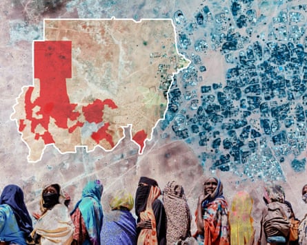
Indeed, it was shortly after Kaamil published another satellite-led investigation back in March – which examined attacks on a village in Darfur as part of the ongoing war in Sudan – that a source contacted him and suggested he apply the same reporting techniques to a particular area in western Myanmar.
“One of the challenges was that this was a very remote area. Satellite providers weren’t passing over it regularly so, to begin with, we were really struggling to get the quality of images we needed. There’d be big gaps in the timeframe, there weren’t images from the right day, or they weren’t the right resolution.”
All these things can hamper journalists’ efforts to make informed comparisons.
Ashley recalls facing similar issues over the summer when we used satellite imagery to assess the impact of the wildfires across Europe. “We needed to look at historical images to see the burn scars and assess how certain landscapes had changed,” he explains. “But quite often we are restrained by whenever a satellite goes around Earth and captures images of a very specific area. You’ve got to hope that it’s the right time of day and exactly the right area, and also that there are no obstructions such as cloud cover or smoke obscuring the landscape too much – which in the case of the wildfires would often happen.”
Even when our data and visual journalists manage to source clear images of a specific area on a specific day at a specific time, there is still a lot of corroboration to be done. Kaamil offers an example from his investigation into the attacks in Sudan: “There’s a lot of destruction in Darfur, but some of the satellite images of burnt landscapes were actually related to agriculture rather than the war, so we have to be very careful about checking and not making assumptions.”
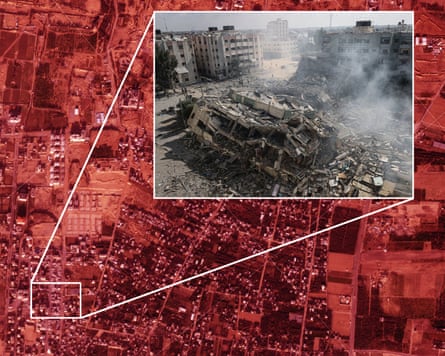
Ashley points to another example from his team’s extensive use of satellite imagery to report on the destruction of Gaza over the past three years. “You would see a circular object and you might think it’s the dome of a mosque. But a circular pattern could also indicate a crater. So then, for example, we’d use images from other times of the day to see if there are any shadows that suggest a building.”
For last week’s story about the Rohingya villages, Kaamil corroborated the satellite imagery using eyewitness testimony from some of the sources he has kept in touch with during his years of covering their plight, as well as other sources of data. “For instance, on top of satellite imagery, we also used fire data from Nasa, which has sensors that detect every fire of a certain size. That helped us to verify that fires actually happened in these villages on the dates that people said that they happened. We also used conflict data because it was very important for us to be sure that these villages were not destroyed as a side-effect of shelling during battles between the insurgents and the military – that they were actually systematically destroyed. The conflict data showed us that there were actually very few battles during the period of destruction indicated by the satellite imagery, because at that point the insurgents had complete control of that particular region.”
Gathering all this supporting evidence isn’t just about corroborating things. The interactive article we published last week presents some of those eyewitness testimonies, together with photographs and video clips, alongside the satellite imagery. The result is a more immersive experience that gives audiences a fuller picture of what has been happening on the ground.
“One of the big limitations of satellite imagery is that it’s literally very distant from the human story on the ground,” says Anna Leach, a visual projects editor who also worked on the investigation. “But of course this is a very human story about the displacement of people, and we always try to show that human element in everything we do.”
“We tried to make sure the article remained connected to the people affected,” adds Prina Shah, a senior digital designer on the Guardian’s visual team who also worked on the project. “So we included photos of villagers’ faces and other images to show that people actually live here and it’s not just about circling things on a map.”
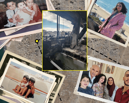
Ashley highlights another example from our coverage of the war in Gaza. Published in December, the article in question used satellite imagery alongside on-the-ground photography to chart a woman’s two-year search for safety in the ruins of Gaza. “We tried to show all of the different places that she was displaced to and how each of those places got destroyed, and so she just had to keep on fleeing,” he says. “Combining the satellite imagery with more traditional reporting techniques meant we could tell her story and also contextualize it. We showed the human story, but the satellite imagery allowed us to show, for example, all of the other tents that surrounded her tent and so you immediately see that her story is just one of thousands. Satellite imagery is really effective for giving people a sense of the scale of what’s happening alongside what’s happening to individuals.”
Given that our satellite-based interactive articles often contain multiple perspectives and narratives, our visual journalists also put a great deal of effort into honing the experience of scrolling down as you read them and see the visual evidence. “We’re thinking about how we explain quite complex imagery in a digestible way to an audience that might be viewing it on a mobile phone,” says Prina. “This can entail things like ensuring different elements pop up when they’re meant to and fall back when they need to because the audience’s attention needs to be focused on different aspects of the satellite imagery, for example, or on the personal accounts that are presented simultaneously.”
This process involves a lot of testing and fine-tuning before the article is published. “Certain issues only come to light when you’re playing with the actual interactive and refining interactive elements and animation and transitions to improve focus or understanding.”
Having spent so many years reporting on the Rohingya, Kaamil really appreciates the team’s efforts to bring the story to life: “We’ve tried to go beyond satellite images that just show destruction. People might get immune to that,” he says. “Also, the Rohingya refugee population has existed for so many years now, it can seem like a stagnant situation. Presenting things in a fresh and different way is part of how we try to make people care and ensure that our reporting has impact. So these forms of journalism help us to report on things that aren’t always on the news agenda.”
The investigation into the erasure of Rohingya villages was part of the Guardian’s Global development series, which is supported by theguardian.org.
KioskNews shows a cleaned-up reading view extracted from the publisher’s page — the original always lives on their site, not ours.