Design trends: Comfortably contemporary
We independently select everything we recommend. Buying through us may earn us a commission, which supports our work.
One of the most common objections levelled at contemporary design is that all that open space, plain white walls, and absence of embellishment can make a space feel cold and even anonymous. Jessica Cinnamon’s design for a King City new build provides an elegant response to this notion. Using a delightful blend of finely wrought details, rich materials, and artful contrasts in scale and form, it’s certainly grand — but clearly also a comfortable and personal family home.
Sign In or Create an Account
The clients are entrepreneurs with two university-age kids. Both parents love to entertain, whether friends, business colleagues or extended family, so a standout kitchen and plenty of elbow room for guests was high on the priority list.
“From the very beginning, the clients said they wanted the house to feel like a home,” says Cinnamon. “So even though it’s full of straight lines and big volumes, the goal was to introduce curves, texture and contrast to soften all that rectilinear geometry.”

The home, built on a generous lot in a King City neighbourhood, feels surprisingly secluded, observes Cinnamon. “As you drive up the road through the woods, it doesn’t reveal itself practically until you’re upon it,” she notes. Even the neighbouring houses are screened behind trees, adding to the feeling of being in the country, rather than part of a suburban neighbourhood an hour away from a large city.
By contrast, the entire two-storey rear of the house consists of full-height windows, overlooking a wide-open vista of rolling hills, horse pastures and a golf course in the distance. From early on, making that view the central player was another important guiding principle.

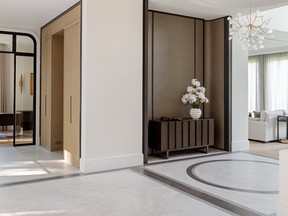
The front doors open into a grand, welcoming foyer with a ceiling that soars to a commanding 24 feet. In contrast — the first of several interesting architectural contrasts that have a striking effect on the feel of the space — the foyer leads into a central hallway where the ceiling stops down to about 12 feet. This hallway essentially sets the tone for the warmth and elegance that characterize the design as a whole.
Here, as with most of the interior, the walls are mainly pure white, the better to capture the abundant natural light that washes down throughout. But it’s anything but sterile. A series of design “events,” large and small — a white oak-clad coat closet off to the left, walnut-stained alcove and console at the foot of the stairs — bring the large space down to human scale, and make the hallway feel both elegant and artistic.
You can clearly see the effect of playing with scale in the twin keylines of grey and charcoal that section the marble floor into adjoining squares, visually tempering its expanse. At the foot of the stairs, dead centre in both the room and the home, a large grey and black circle creates an almost literal centre point, from which all the main floor rooms seem to radiate. Directly above it, a chandelier hangs from the centre of a series of concentric circles, like ripples on a pond.

These two sets of circles, above and below, form the most prominent curves that counterbalance all the rectilinear architecture. Other curves recur in the corners of archways and the top of the glassed-in entry to the home office off the hall.
But the real star in this part of the house is the staircase. As is so often true of staircases, often the simplest forms conceal the most highly complex engineering. Jessica points out that, to keep the look as clean and pure as possible, there’s virtually no millwork, casings or extraneous materials within which to hide joinery; all you see is the waterfall-style treads flush against white walls. A straight guardrail rises through the centre, changing direction at the foot and the landing with a graceful pirouette. The closest thing to decoration is the hand-patinated brass handrail that follows the curve of the guard from top to bottom.

Straight ahead is the family room at the back, and the ceiling soars again to full height. On the wall outside the kitchen, set between two dark-oak clad archways leading to kitchen and breakfast room respectively, hang a quintet of custom canvases, “Marrakesh Nights” by Tony Koukos; the grouping is set between a pair of slim sconces, each one framed by slender mouldings that run from floor to roof. It’s an unabashed celebration of the exceptional height of this room.
But this is after all, a family room, and the same trick used in the front hall — playing with ceiling height, materials and subtle detail — contrasts the breathtaking view that dominates the whole room. At the opposite end, the ceiling drops again, above an inviting seating area warmed by a fireplace clad in veined black sintered stone. (Cinnamon notes in passing that a black backdrop is a great way to help the family TV blend into the decor, a perennial problem in family rooms.)
She laughs that the custom-designed U-shaped sofa is big enough for the entire fam to stretch out together on movie nights, while softly upholstered swivel armchairs add extra seating for friends. An undulating two-piece brass coffee table adds warmth, and contrasting curves, to complete the composition.

Twin marble-topped islands are the centrepiece of the kitchen; dramatically veined grey and white marble sets the standard, says Cinnamon, and everything follows from there. Following the repeating motif of patinated brass deployed throughout the house, custom drawer pulls and brass-covered range hood add a touch of warmth, and blocks of other tones — black-clad cupboards by the pantry area, pale grey uppers, splashes of white oak on the inner island — add variety to the composition.
“With a project like this, it’s always great when you’re able to incorporate the architecture with the interior design,” says Cinnamon, who was brought into the project early enough to be able to specify details like the shapes of ceilings and millwork.
“The success of the project is really in the balance: the home feels grand and architectural, but at the same time, it’s warm, comfortable, and personal.”
Join the Conversation
This website uses cookies to personalize your content (including ads), and allows us to analyze our traffic. Read more about cookies here. By continuing to use our site, you agree to our Terms of Use and Privacy Policy.
KioskNews shows a cleaned-up reading view extracted from the publisher’s page — the original always lives on their site, not ours.